


I led a participatory design exercise as a means for redesigning a financial product’s promotional webpage and optimize the products sales funnel.
Role: Lead UX Researcher
Process/Methods: Competative Analysis | Affinity Clustering | Participatory Design | Bullseye Diagram
Solution: A redesigned promotional webpage with revised content that is best suited for the needs of our users in making a purchasing decision.
Project Background
In 2017, the financial industry at large was in a competitive race to develop robo-advisor products. As a disruptive technology, robo-advisor's leverage AI to offer automated digital management of investment portfolios. Betterment and Wealthfront were early market leaders for this new, low-cost, and effective alternative to traditional financial advisor services. As a user experience practitioner at Wells Fargo Advisors (WFA) in 2017, I helped design Intuitive Investor - their robo-advisor platform.
Shortly after Intuitive Investor launched, website traffic showed an underperforming sales funnel. This sales funnel began with a promotional webpage that led into a short questionnaire to produce a recommendation for users. This recommendation is Intuitive Investor’s point of sale and outlines a custom approach for how Intuitive Investor manages a user’s investment portfolio.
Foundational research at the time suggested that our users did not readily understand Intuitive Investor or how it works robo-advisor’s work as a financial product. Myself and the Intuitive Investor team hypothesized that the promotional webpage (initially authored by marketing representatives without our consultation) failed to communicate information our users need to make a purchase decision. If the product had no minimum cost with low commitment, this would not have been a concern; however, Intuitive Investor required a minimum investment of $10,000 and involved extensive time and tax implications. Furthermore, a differentiator for Intuitive Investor amongst robo-advisors was its integration of human advise alongside AI technology. This differentiation made the product more difficult to explain since the basic concept of robo-advisors was not well understood by our users.
“To redesign Intuitive Investor’s promotional webpage, I led a participatory design exercise that discovered information our users need in their purchasing decision, the priority of this information, and how it is best presented.”
Why this Approach

As our team ideated on promotional webpage improvements, we needed to understand how and why our current webpage was failing. A straightforward approach would be user testing; however, I determined we could get the same feedback via participatory design and in addition receive the benefit of broader ideation spurned by our users’ unique and unbiased perspectives. To conduct participatory design, I had to instruct our study participants what was being designed. In this, I could receive the same feedback we would have gained through standard user testing.
Instead of verbally describing the task which risks myself coaching our participants on the Intuitive Investor product, I designed a protocol where study participants reviewed the current promotional webpage as a first step. After this step, I asked our participants about their understanding of Intuitive Investor, if the product interested them, and what further they needed to understand before taking next steps or purchasing Intuitive Investor. I then used their answers as prompts for participatory design.
Initial Research

As a prelude to participatory design, I conducted competitive analysis and with the Intuitive Investor team I facilitated an empathy mapping exercise. I then used an affinity clustering methodology to organize output from these activities. I did this so we could draft design concepts as kernels from which study participants could build from during participatory design. This was critical to help our participants draft ideas at the speed of thought. Our participants were typical users and not designers or financial experts. This made them ill-equipped to translate ideas into designs quickly without help or guidance. For this reason, I facilitated each session alongside a designer who played the role of “creative midwife” and sketched the concepts and ideas of participant on sticky notes.
Competitive analysis and affinity clustering gave creative fodder to the study’s designer. Prior to our participatory design sessions, myself and the designer used this fodder to draft concepts we could reference and use throughout the study.
Study

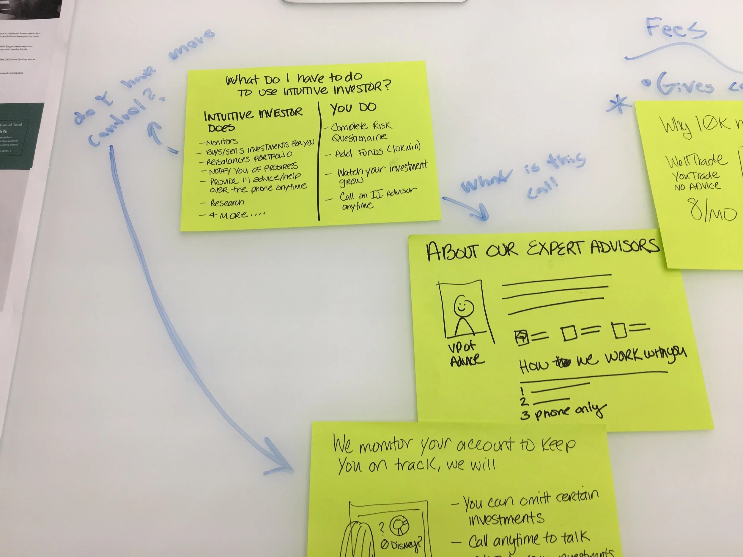
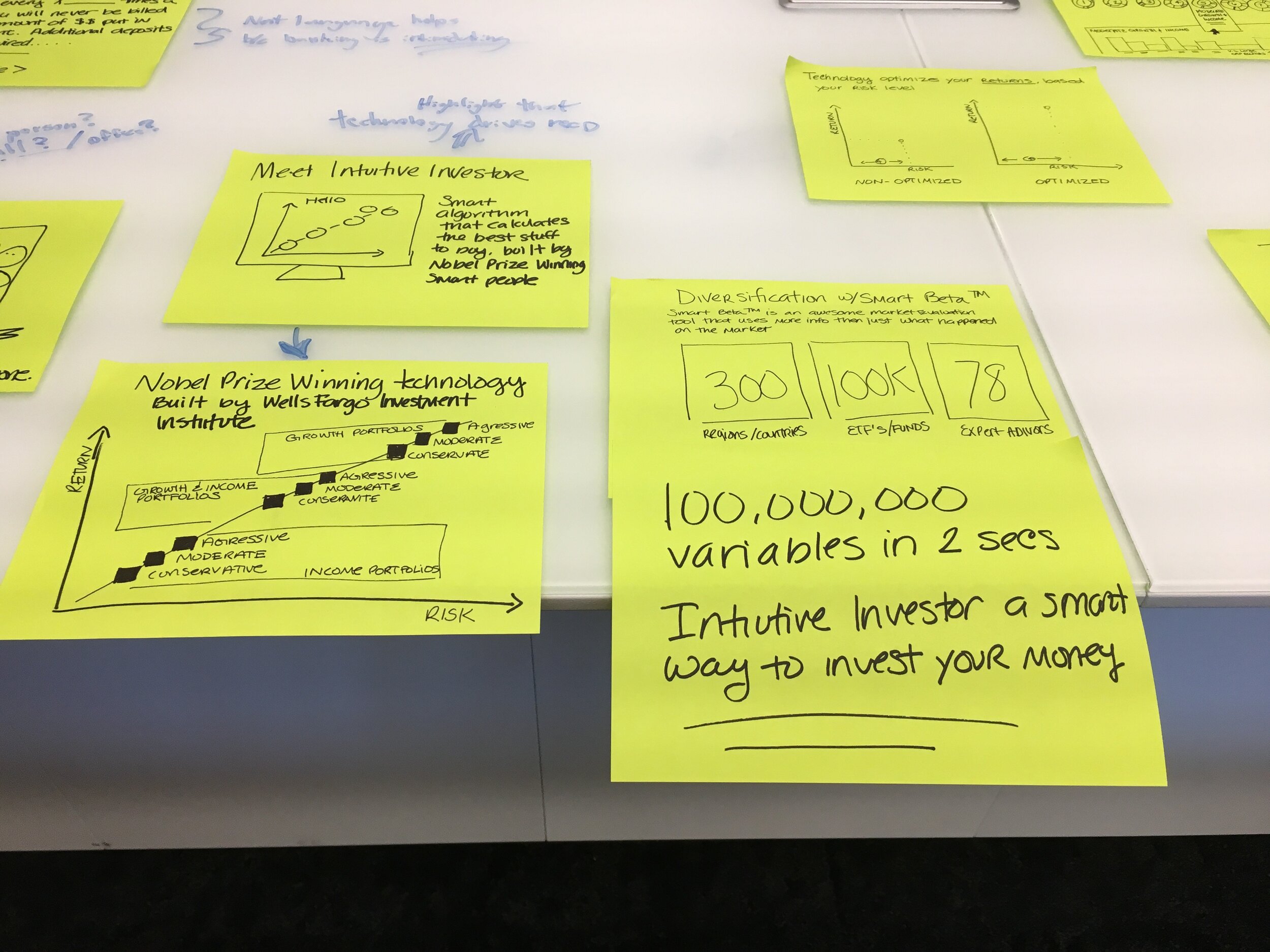
As previously explained, participatory design sessions began with what was essentially user testing on Intuitive Investor’s current promotional webpage. Following this, I prompted participants to describe information they want and questions they need answered to make a purchasing decision. As participants answered, my design partner sketched solution on sticky notes or shared relevant concept from initial ideation or earlier participatory design sessions. From each concept, I asked participants if what we sketched is what they wanted and if not why not. Through an interactive, conversational process we refined designs over the course of a 30-minute session.
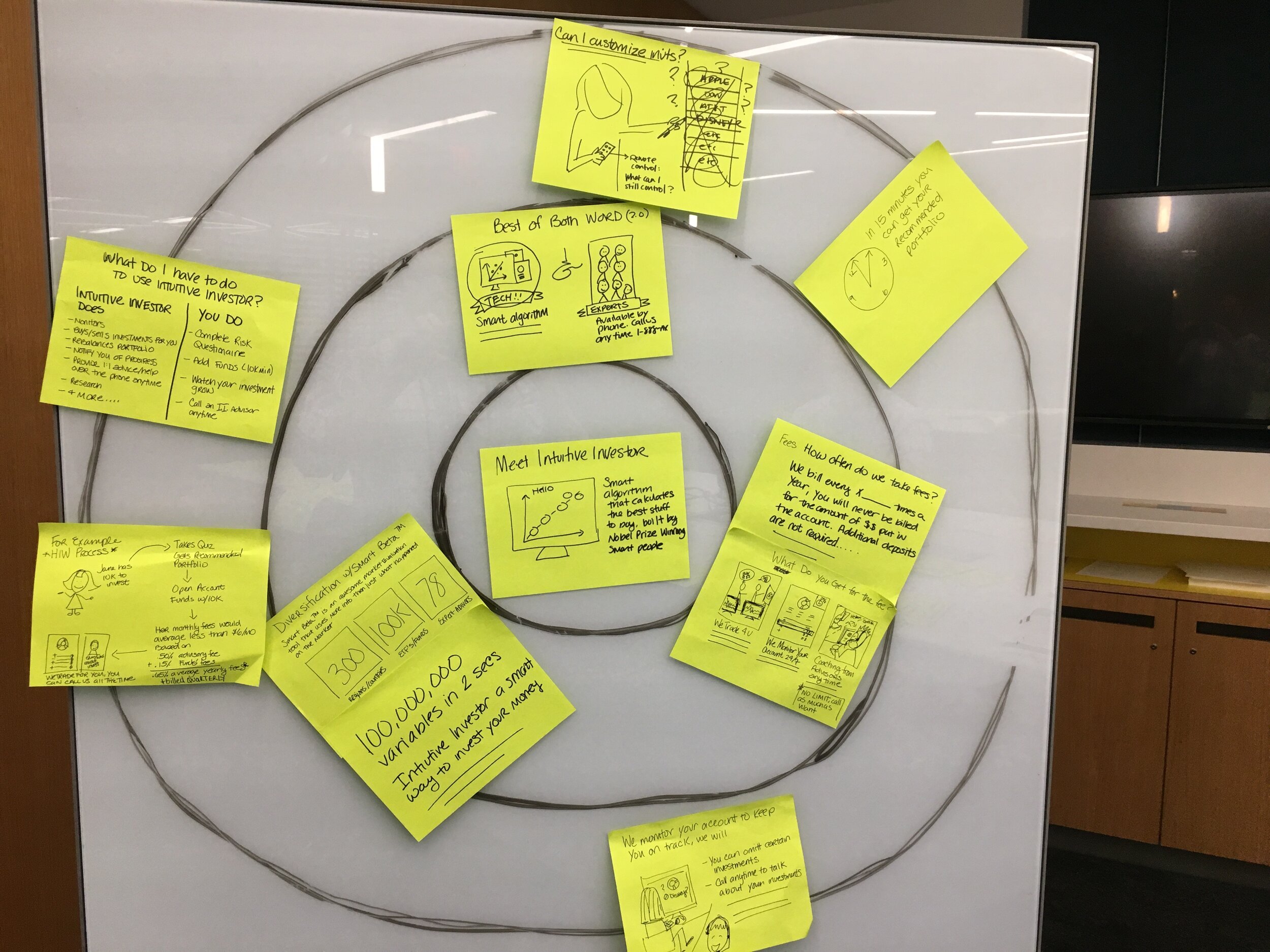
At the end of each session, I asked participants to place their designs on a bullseye diagram. I did this to understand our user’s prioritization of content and determine if trends existed across our six participants. The results helped us determine and information architecture for the redesigned webpage. I specifically asked each participant to place one design within the center of the bullseye diagram, three within the middle ring, and all everything else on the periphery.
Outcome

In analyzing results, I discovered a trend in the journey of questions our user’s sought to answer for a purchasing decision. This journey began with an evaluation of what they as the customer do versus what Wells Fargo Advisors as the product’s provider does. After this, users seek to understand what the technology behind Intuitive Investor does versus the human advisors (Intuitive Investors differentiator amongst other robo-advisors). With this understanding, users want to know how human advisors impact their specific portfolio and be seek confirmation of their qualifications.
With our results, I provided an information architecture recommendation that was used to redesign Intuitive Investor’s promotional webpage. In addition, I provided the project team with the design sketches created during the study and mapped these sketches to the information architecture I recommended. With the launch of the new promotional page we observed an increase in the number of promotional webpage visits resulting in users progressing to the questionnaire portion of Intuitive Investor’s sales funnel.
